 |
| Geoff Grandfield montage |
Monday, 14 February 2011
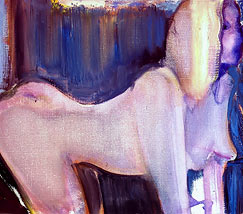
Marlene Dumas
At the suggestion of my tutor, I had a look at the work of Marlene Dumas and I thought I would share it with you.
Born in South Africa in 1953 she now lives and works in Amsterdam, Dumas uses the human figure as a means to to critique contemporary ideas of racial, sexual, and social identity. The very rawness, tone and subject matter reminds me of the work of Lucien Freud and Jenny Saville but with a much looser more expressionist style.

Born in South Africa in 1953 she now lives and works in Amsterdam, Dumas uses the human figure as a means to to critique contemporary ideas of racial, sexual, and social identity. The very rawness, tone and subject matter reminds me of the work of Lucien Freud and Jenny Saville but with a much looser more expressionist style.
 |
| Blue Marilyn |
 |
| Supermodel |
 |
| Young Boys |
 |
| Bronze Meryl |
 |
| The Stripper |
Tuesday, 8 February 2011
Exercise - Giving instructions.
Below are some of the examples of reference showing instructional diagrams or illustrations on how to perform different tasks;


 |
  |
I like the format of the Esquire illustration above, with the simple square diagram and paragraph of copy
explaining the process below each square, but for my illustration I would like a more 'circular' shape to the
drawing overall which will lead the eye on a natural route from start to finish. I have started by writing a basic list of instructions which will give me an idea of how many 'stations' I will require to complete the illustration. This reveals that I will need six. I have the idea initially of basing all the diagrams around a large tea cup in the middle and sketched this out - see below.


I think the squares around the tea cup version above is working well, and have introduced little arched arrows, making the journey more obvious, losing the numbers, and I think this also adds to the 'circular route' feel I was looking for. I have also sketched out a rough above showing a square format which has a very simplified look to it. The numbers are back in with copy that will sit in the corner of each diagram. I was thinking in terms of a black and white line drawing maybe, with the number and copy lines in red?


I'm quite pleased with the final image below, and having shown it to a few people have had positive feedback. 'Could have included teaspoon with sugar', was one comment but I personally think this would have made the design too 'busy'.
As an afterthought I would have liked to have added a pale colour in the background but due to my limited skills in Indesign, finding this very difficult to 'just change'. I really need to nail my digital techniques as I am taking too long to do what should be fairly simple tasks. Need to consult my Illustrator 'guru' for more lessons...

Saturday, 5 February 2011
Exercise - Abstract Illustration.
Task - Listen to a piece of music by Miles Davis and as you listen to the music, create marks to illustrate your interpretation of the essence or mood of the piece.
I chose the Miles Davis track 'All Blues' from his album, 'A Kind of Blue' and just listened to the music, whilst making marks, patterns and squiggles that I felt represented the mood and feel of the track. I intended to start with a pen drawing, and then add colour and alterations in Illustrator.
 |
| Penterpretation 1 |
Its difficult as you sit there with your pen, trying to 'draw' the music or mood, but I suppose I'm comforted by the fact that there is no wrong or right answer. Its just my interpretation. After looking at my first efforts several adjectives came to mind such as swirling, spiralling, rounded, spiky, smooth, but I think the one that suits the piece best is 'spiralling' in the way the music seems to peak and subside.
 |
| Penterpretation 1 coloured in Illustrator |
It seems obvious to choose blue as the predominant colour for this image, but it suits the piece and reflects the cool, smooth feel in its neutrality, with the darker red offering contrast and the blacks emphasising the peaks and shadows, and giving a sense of depth.
 |
| Penterpretation 2 |
This is my second, and very different sketch which I intend to visually adjust in Illustrator. I dont think the drawing really does such a good job as the first effort but there are elements which work.
 |
| Illustratored Penterpretation 2 |
As you can see, the digitally adjusted image above bears little resemlance to the scanned image 2, but once I started to distort the marks I had made, whilst at the same time listening to the track, it seemed to evolve and the actual process of 'warping' and distorting the existing marks seems to suit the task. I kept the colours cool and reserved and feel this one captures the mood.
 |
I decided to go the dgital route, by drawing in Illustrator and then manipulating the basic image and I feel these are more successful. I think I have improved on the one above by toning down the colours in the one below to give a cooler more mellow feel.


I have also introduced some graduated tints into this one, along wth more subtle use of black.

Simply by increasing the stroke of the black line has given the image above more definition and changed the
mood of the pic quite dramatically. It feels stronger.

Another different approach which I feel offers a representation of the track, just trying to
show another avenue.

Spiralling seems to suit this image pretty well but I am pretty happy with all the Illustrator images. They are all quite different but each version has its merits. I think they could all be used for a cd cover, but then i would, wouldn't I?
Wednesday, 2 February 2011
Exercise - Image development - final image.
I decided to improve on my previous efforts by adding some texture in the shape of a 'sack-cloth' material which I blended into the background. I thought the colour and texture of this really went well with the photograph, especially with the grainy quality of the image. I then added some colour and more texture with the striping and then finished off with the text.. The last task was to make his face more visible wth the use of the old magic eraser, (it really was'nt as easy as I am making this sound, for me at least), and envolves many hours of frustration but without wishing to sound smug, I'm quite pleased with the result.
 |
| Finished image. |
Saturday, 29 January 2011
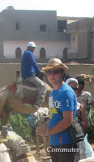
Exercise - Image development
Object of exercise - to take an image with a range of content and then crop it in ten different ways, Note if the images have more drama by the way they have been cropped. Choose a word for each image that relates in some way to the content, but this may contradict the image or show an alternative interpretation.


More to follow.
 |
| Original Pic |


I decided to work on the image with the young egyptian camel guide/handler or whatever the correct terminology should be, but use the word 'Youth' instead of 'Teenager'. I think the word and the image
go well together but also offers an element of contradiction to the usual image of a typical 'Youth'.
I wanted to create a poster by using Photoshop as opposed to a drawing or painting as I liked
the slightly grainy quality of the photograph and the mood of the shot.
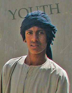 |
| Preferred image with new word |
 |
| This looks better with the lettering but still not dramatic enough. More work needed. |
Exercise - Reading an image

The image depicts a cavern/cave which appears to contain a sleeping dragon, which seems to be guarding a pile of golden treasure and a throne. Discarded armour and weapons litter the floor, perhaps at one time belonging to previous trespassers, who were unsuccessful in their attempts to steal the treasure or slay the dragon. In the mouth of the cave are two young adventurers, one of which is carrying a flaming torch which is illuminating the walls of the cave. The suggested narrative is that these two have ventured into the cave to kill the dragon and win the treasure trove.
The colour pallette consists of bright red which illuminates the dragon and this is also used along with yellow and orange to suggest in an abstract way the walls of the cave. Complimentary colours of purple and blue give depth and tone to the shadows and the light blue and green give a feeling of coldness to the ground and entrance. The hottest colour is the red, drawing your eye to the dominant character in this scene, the dragon, and the red and orange of the torch leads your eyes to the two figures. These two figures are noticably smaller than the sleeping giant, giving a feeling of the enormity of their task.
The use of texture in the blue floor and the jagged purple entrance of the cave, along with the way the glow of the torch has been depicted to suggest the rough walls of the cave.
The use of red seems an obvious choice for a fire-breathing dragon and the composition of the picture and connecting complimentary colours lead the eye around the scene in a circular route.
Subscribe to:
Posts (Atom)