Total Pageviews

Saturday 23 April 2011

Exercise - Identifying toos and materials - final.

Mode 2


After going back over the illustrations I have chosen, I have decided to go back to the Mode 2 image and his way of drawing and painting directly onto a cardboard backing. He has composed the image in such a way that the figure dominates, and his viewpoint comes from below emphasising her curves and pulling the eyes to the backside. He has painted in a white background in the top of the frame which the foreshortened upper torso seems to melt into. The limited pallete and strong lines have a graphic comic-like feel and the accentuated curves lend themselves to the caricature. The tones used make this image feel very powerful and the grain of the corrugated board brings its own original texture into the picture.


Using the same materials, (the back of a shoe box) I had a go at at visual I had done previously starting off with a sketch and then tried white pencils at first but then realised I couldnt get the coverage and opacity this way, so swapped to acrylic which I always seem to struggle with, mostly down to the speed with which it seems to dry.... I feel like it works in some ways but doesnt in the way that Mode 2 seems to make it work.
I need to work on the quality of my drawing and maybe use a different media such as pastel and oil next time round.

I then had a go at producing a piece of artwork in a very different way, and chose a display of flowers, which I skatched in pen and then scanned this in and converted into an illustrator file. I then coloured the illustration digitally trying to keep to a small colour pallette. See below!


Sunday 17 April 2011

Exercise - Tools and Materials continued.

Mode 2
I really like the work of Mode 2. The image above is one of a series he has produced painted primarily on brown cardboard. Using a limited pallette and excellent draughtmanship, his sometimes explicit figurative work looks at life from a different angle and perspective. This series was painted on opened-out cardboard boxes.

Audrey Kawasaki
Similarly, the figurative work of Audrey Kawasaki is in a limited colour pallette such as Mode 2, but in this instance her work is painted on wooden boards with the texture and grain of the wood showing through the finished image.

Sunday 10 April 2011

Exercise - Identifying tools and materials


Billie Jean Fig. 1.


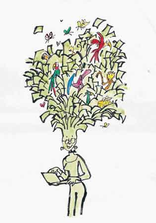
Billie Jean - uses a combination of hand-drawn illustrations, photgraphs and collage together with a strong use of type and colour.  The contemporary feel of his work comes from his use of line work and symbolism, and each image is abound with metaphor, such as the simple but varied ideas and shapes surrounding the head in fig.1. which seem to represent his thoughts and individuality. Fig 2. shows the line drawings and images that connect through the decades.

Billie Jean Fig 2.

Peter Blake Fig. 3.


The work of Billie Jean holds some similarities for me with one of my favourite artists, Peter Blake, whose iconic images, especially in the world of music and album covers, and has remained in-vogue and inspirational for decades.
 The use of hand-drawn images, coupled with collage, type and a collection of symbols and pop art give a real retro feel.


Kate Gibb Fig. 5.

Kate Gibb Fig 6.
The work of Kate Gibb seems to be a natural continuation as far as similarities go with the two artists above with the use of photgraphy, collage and mixed media.

Renowned for her silk screen and textile designs she is best known for her work in fashion and music.


The following artists to me, seem to hold a connection, in the simplified look of their work, which shows illustration in its rawest form, pen and ink with a simple coloured wash. Peter Gates with his simple images captures the mood and subject perfectly with his colours and drawing style.

Peter Gates

Quentin Blake is one of my favourite illustrators, probably because I seem to have been looking at his
drawings most of my life, especially in this role as book illustrator for Roald Dhal. He has illustrated over 300 books and his style is unmistakeable, with its humour and originality, always a little off the wall.
Quentin Blake


Ollie East


Ollie East from Elbows Neat Little Rows

Ollie East follows on from this with his simple childlike images using metaphor and symbolism in his naive-like paintings and images. Another artist who has been working in the world of music, most recently for Elbow on their last two albums.

Banksy

David Foldvari


I see similarities in the techniques and medium used by Banksy and David Foldvari, below, not only in the use of Grafitti-style art, but also in the use of metaphor.
David Foldvari
 Sanna Annukka's work looks to me like bright vibrant printworks, with her use of folklore based symbolism, and vivid colours.

Sanna Annukka


Parra.


 I see some similarities in the work of Parra which seem to resemble screen printed posters and flyers. Hand rendered typefaces, minimal colours and exotic creatures adorn his work.
to be continued...

Saturday 2 April 2011

Assignment 3 - A poster continued.

From the sketches I produced below I scanned in and digitally coloured the image of the man playing the trumpet, and then produced the poster below. I quite like the simple, minimalist effect. Just black and white with a hint of yellow to catch the eye.


With the same figure in mind I did the thumbnail sketch below which would show the same image repeated around the poster in various states of magnification, and also in different colours...


This was a rough idea taken from an earlier
colour sketch. I like the idea of the
diagonal text


Fig 1.
Figure 1 shows the two line visuals for two of the posters I have previously done in last post. I have tried to keep the detail to a minimum, showing the bare structure and content with a representation of type to show
where the finished position would be.

This is my line drawing for the final selection, utilising the
figure and the idea of a repeating image.

This is along the lines of what I have been aiming for. I think the use of Broadway for the main 'JAZZ'
heading works well, and after much experimentation switched to 'Papyrus' for the other copy. 
It seems to be easier to read but still works well alongside the Broadway font. There is still some
way to go before I am happy with this. See below.


This is my final poster. I have added a 'smoky' texture to the background, moved the line of copy to the foot of the image to help balance and finally I have toned back the brightness of the yellow in the horns.