Total Pageviews

Saturday, 26 May 2012

Exercise - Working for children.

For this exercise I had to gather as many examples of images for children as possible.
The following images go with the following age groups;

Pre-reader.

Pre-reader.
Usually these are mostly just picture books and are often made from cardboard as the little ones take as much pleasure in eating the book, as they do looking at it. Plastic, material as well as heavy-duty paper are also popular, and often come with squeakers, sound-effects and pop-ups. Spot was always popular.


Pre-School.

Pre-school (3-5)
From what I can remember, my kids always loved Spot the Dog, drawn by Eric Hill, which was always furnished with a few memorable words on each page to describe the scene being shown. It always amazed me how quick they memorised each page. Julia Donaldson books, drawn by Nick Sharratt are a popular read, offering repetition, numbers and lively images.

Early Reader 5-7


Early reader (5-7)
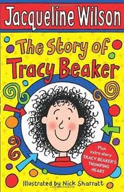
Repetition, rhyme and the use of poetry is important in this age group and the images can be more detailed.


Established reader 7-9


Established reader (7-9)
The books this age group are interested in can be more sophisticated, less obvious in their storyline allowing the children to develop their inference skills. Images can be more detailed, slightly scarier even.


Older age groups
Longer storylines, often less images throughout with the emphasis being on the strength of the storyline. More use of comedy and a brighter, trendier cover.


I really like this set of stamps featuring childrens illustrations and the diverse styles of 
each one. Some very sophicated and others very simple and childlike, but each
working in its own way.


Spider-grams finding appropriate word connections for  the words 'discovery'
and 'journey'.

Below are some of the images I have sketched of various animals, with the 
intention of aiming towards the 3-5 year old pre-school reader and also the early readers 5-7.

I think the travelling rabbit shows promise, looks a bit serious for 
the little ones though....could be ok for the older children though.


For some reason, I really like the idea of drawing cows and I think
they always look a bit 'thick', also not sure if they work very well
doing activities other than eating grass or farting..


I've moved on to the idea of a travelling octopus......
below are some ideas of what he might look like.


'Olly's journey could be based on images of his adventures, from 
starting out,  planning his trip to catching the train, and then
followed by images of him visiting famous world sites.
This could work well for small children in a geographically
educational format.


Olly's look is starting to come now,  I like the idea of putting him in different 
situations, doing stuff that Octopus's dont normally do. He also has the 
benefit of eight arms/tentacles, so there's plenty of scope for artistic licence.

I have decided to go for a really simplistic style, so as not to confuse the younger children, although, 
thinking about it, I dont really believe that images have to be ultra-simple for
a young reader to appreciate them. Kids love looking at things, regardless of how complicated
they are, and tend to be selective and take away their own key points and views.
However, if an adult sits with a youngster and helps him/her to go through the book, 
the child can be steered in the right direction,.....i think.


Rough colour of cover
I like the idea of a the pages in the book looking like a polaroid photograph 
of each travel page with 'Olly' in the foreground of a famous landmark.
I've tried to keep the typeface 'fun' and informal. also I have the idea of
allowing the octopus to change colour ( I seem to remember them being able to do this), 
like a chameleon and this could go down the road of  'Where's Olly'? as most
kids love a bit of hide and seek.


Monday, 7 May 2012

Exercise - Packaging.

Brief - to produce a series of illustrations to be used for a range of organic biscuits for children. Raisin, Choc chip and Ginger. They need to feature extinct animals interacting in a fun way on the boxes. Full colour to reflect the flavour of the biscuits.
Research the market - how will it stand out?
Does the product exploit poster power or appeal to both adult and child.
Does it also need characters suitable for young children. What style? Type - hand-drawn or straight?


As a means of research I visited the supermarket to have a look at the way that biscuits are displayed and how they are positioned to attract their target audience.
For instance, it became apparent that the packaging that
was geared for younger children was placed on the lower
shelfs where the kids would see them at eye-level.
Also, the colours used for the childrens biscuits were brighter and utilised bright, primary colours 
Enhanced by Zemanta

I then looked at what was available in terms of extinct animals to choose from, so looked on t'internet and 
found the following ;
Sea Cow - not too keen on this as it doesnt make me feel very hungry.
Caspian Tiger, Sabre-tooth Tiger, Wooly Rhino, Hairy/Wooly Mammoth (quite like this as
the word 'mammoth' offers connotations of huge/large, and everybody likes a big biscuit.)
Giant Turtle (definitely not edible), Pterodactyle (too chewy), T-Rex - (not loveable enough), Raptor (like this as it goes well with the word 'raisins'.)
Dodo - this has got to be a good choice as everyone's heard of the Dodo and the name will go well with most things....ie. Dodo Droppings, Dodo crackers, Dodo cakes...etc.


I looked at other name options based around the three animals, Dodo, Mammoth and Raptor.
Mammoth biscuits, Raptor Raisins, Raptor Crackers, Ginger Raptor Crackers, Choc-chip Dodo droppings.
On a serious note, I wanted to make the name fun and attractive to young kids....


....which is why I wonder what I was thinking with this effort.
This idea would probably be too scary for young children and have the opposite effect...

Raptor sketches

These two raptors at could be good, they dont look too fierce and I have given
them a hint of a smile...
Dodo sketch


I've picked out the three key colours for Raisin, Choc-chip and Ginger as above, not sure yet whether to 
go with a hand drawn or traditional font, will try some more ideas later.


Reggie the Raptor.
This is 'Reggie' the Raptor, Not sure if he's friendly enough, but I wanted him to have a bit of an edge cos he's sort of tough and streetwise. Reggie likes raisins......

'Dora' the Dodo.

Not sure if Dora is the right colour but I like the way she looks, not too fierce, sort of cheeky looking...slightly mental, but a bit of a character. This probably explains why they became extinct.

'Martin the Mammoth'
Martin the mammoth has been coloured in a nice bright orange to emphasise his allegiance
to all things ginger, including biscuits.

I have been thinking about the size and shape of the packaging for the biscuits and what shape would appeal to both children and adults. I thought about the packet type biscuits but these were not as
instantly ascetic as the tube-type packs such as the ones you get with Pringles. This type of packaging
really provides a solid base for a strong bright image and also has the added bonus of being a pack
that parents can re-seal and carry around.

'Tube' thumbnails.
I like these cans and the way they sit up and shout; "buy me, I'm expensive but collectable" and there
is the added bonus that when all the biscuits are gone, they can be used to keep 'stuff' in..

As a set of tubes they would look nice and in situ on the shelf, would really stand out.


Also had the idea of a caveman-character, who could be used along with
the animals in various situations. Like the name - 'Biscuit-Smasher'.


Mock up
I knocked up this mock-up of a can of 'Raptor Snaps'. I like the idea of a strong
vibrant colour, which could go with whatever flavour was used, ie, purple for the raisins,
orange for ginger etc.


Tuesday, 3 April 2012

Exercise - Text and Image.

Big  Small    Fat  Thin    Fast  Slow    Fun  Boring    Calm  Mad
Write each word in a way that is descriptive, using the shape and size  to express the meaning. Write in
both upper and lower case.


Using computer software (photoshop), select fonts to suit the words.


I then drew some of the words in freehand and pencil and then coloured them in what
I thought was suitable for each of them. Bit of a puzzler this, in the realms of, who knows
what colour 'Big' should be? Its probably quite subjective and down to the individual doing
the selecting... anyway this is what I chose.


I then created some of the words in Illustrator and chose colours and patterns that I thought
suited the words best. In this instance it was easier to match the subject to the colour/pattern.

For this one I used a heavier stroke which 'grounded' or gave the word more weight. The pattern is actually 
a bit of a Peter Blake poster. I like the way the different colours work together...looks big and brash.

For 'calm' I think the font - 'Hobo' works well, with its rounded edges and curved sides, (there are no
sharp edges to upset yourself with), and the watery effect works well....makes you want to chill out and 
just float there....chillin.


Another version on the 'calm', white is also a pretty calming colour. This also works well. 
I may market this and sell it to Psychiatrists as a sign
or poster for their patients to focus on..


For 'slow' I had a discussion with my daughter who informed me that an orange or yellow was good 'as 
it was the colour you used on traffic lights to slow down'. I cant see any reason to disagree with this 
theory, and I cant think of anything better, so I have gone the whole hog and based the word around a 'slow children' hazard traffic sign. She's not a thick as she looks.

For 'mad' I have chosen the Ravie font which definitely evokes a feeling of 'random' and 'abstract' in its
letter shapes. For the colour I chose one of those never-ending maze-like patterns which, when looked at 
for too long can be know to cause seizures, mainly because thats just the way I roll.....crazy.
After discussing this with aforementioned daughter, she liked the pattern for the word, but for the reason
that she associated the red stripes with the uniform that mental patients wore....?

'Big' Moodboard

The moodboards work well as a catalyst for ideas and creative ways of 
demonstrating a word. For instance in the 'big' moodboard above, the image of the 
large dog looking down on the little one shows perfectly the phrase you are looking for.
 Likewise there is lots of scope with the obvious image of Big Ben.
Maybe a font involving the clock and tower. Interesting the image with the
word BIG made out of money looks very similar to the one 
I did earlier with the Peter Blake colours.
i
Mad moodboard.

Same thing with the 'mad' moodboard....lots of ways of conveying a word or feeling and
it just goes to prove there are no limits to the way you can colour or portray something.
 I really like the image in the centre above of the word 'Mad' which is made up
of lots of smaller illustrations.

Fast moodboard


Sunday, 25 March 2012

Exercise - Travel guides

Brief - produce three illustrations for a series of book jackets, for the locations Istanbul, Helsinki and Milan.
Bring elements together in a diagrammatic way. Use hand-drawn type in an  appropriate style that works with the subject and country. Based on size 210 x 148mm (A5).

For the first part of this I referenced the titles available and then produced a series of mood boards to give me a feel for the individual places and also to help me to find suitable subjects to draw and colours to suit.

I was trying to get a 'feel' for Istanbul and also the popular symbols and relevant shapes and images that
could be used in the form of a sketch or line drawing. I initially have the idea of a simplified outline of one or two of the famous landmarks, with suitable solid colour shapes in the background.

Looking here at symbolic shapes such as the evil eye or the Arabic slipper. Also playing with the idea of 
a list of popular places to visit within Istanbul, each nameplace being drawn in a hand-drawn font. 

Helsinki Moodboard
I have produced two other moodboards, for Milan and Helsinki looking for interesting shapes, sights fonts and colours that represent the city.

Milan moodboard

Above are thumbnails of different ways of producing the series of travel books. On the top line is the 
collection of three with a common theme to tie them together. The main place name at the foot of the page would be in a strong font, maybe white-out of a primary colour, a simplified line drawing of a landmark surrounded with place names (hand drawn) as mentioned before. 


Playing with different font ideas, I like the idea of the word 'Istanbul', drawn with the towers ascending to combine the place-name with the iconic imagery of the mosques.


I like the way this particular style of font is slightly reminiscent of the arabic fonts and 
can foresee this working well in the finished artwork maybe.


Hoping to use this sketch of the Mosque as the main illustration. I intend to redraw in Illustrator to 
simplify the lines.


Pen sketch 1.

Tiled image maybe a possibility?


Pen sketch 2

I'm thinking now of using the two pen sketches above , and separating them with the coloured tile image. It should work
well and also suit the brief. 

This image is looking better. I've added a nice blue sky in Photoshop for this and also the sketch of
the mosque as below.


First visual for Travel Guide.
On the visual above I have incorporated the two sketches around the tile image of the Turkish
symbol and star, and then added the hand-drawn 'Istanbul' text.
Not sure I like this though, with the red and black colours it looks a bit like a Man Utd programme.....

Visual No. 2.
This looks better and seems to be going in the right direction. The colours look better,
bit more like a West Ham fanzine.... Seriously though, the illustrations look better, with
the sky added, but maybe the background red needs to change. I have used Arial font 
for the other text, which seems to compliment the hand-drawn 'Istanbul'.


Enhanced by Zemanta