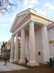
 Image by Ned Trifle via Flickr
To produce three illustrations to be used as a part of a series of A3 posters to publicise the museum to the following audiences;
Child aged 5-9
Teenager (13-16)
General Adult audience
To start me off with this exercise I visited the New Walk Museum in Leicester and took some pics of signs, artefacts and things that I thought in some way represented the museum. I also researched in books and the web all images I could find on the subjects of dinosaurs and Egypt, which happen to be featured at the museum.
I made a list or spidergram of all the things that I thought would appeal to a Child of 5-9 years that were on show there as follows;
Creepy Crawlies, Natural History, Exploring, Pets, animals, Dinosaurs, Monsters, Mummies, legends, Kings and Queens, dressing up, Knights, weapons, toys,
Creepy Crawlies, Natural History, Exploring, Pets, animals, Dinosaurs, Monsters, Mummies, legends, Kings and Queens, dressing up, Knights, weapons, toys,
fairy tales, Games, workshops, play and art.
I tried to put myself in the childs place and think of what it was that excited me whenever I visited the museum as a child and the dinosaurs and mummies always held a fascination from what I can remember, as well as a sort of fear.
I tried to put myself in the childs place and think of what it was that excited me whenever I visited the museum as a child and the dinosaurs and mummies always held a fascination from what I can remember, as well as a sort of fear.
I then did a mood board, using the images I had collected to give me a feel for what I was hoping to achieve.
My only concern at this stage which has surfaced whilst looking at the moodboard is the percieved ferociousness of the dinosaurs, and how children would react to this? Maybe its a good idea to make the dinosaur a 'character' such as 'Barney' which would appeal to young children and could be used in a visual form within the museum in the guise of a guide on posters and notices etc.
I really like this simple, childlike lettering. Bright primary colours, which look like they are cut out of foam and stuck on the fridge would look good on a poster and shout FUN!. I am thinking of creating letters using 'bones' to go with the dinosaur theme and would like to achieve the same feel as the letters above
 |
| moodboard for childs poster |
My only concern at this stage which has surfaced whilst looking at the moodboard is the percieved ferociousness of the dinosaurs, and how children would react to this? Maybe its a good idea to make the dinosaur a 'character' such as 'Barney' which would appeal to young children and could be used in a visual form within the museum in the guise of a guide on posters and notices etc.
I really like this simple, childlike lettering. Bright primary colours, which look like they are cut out of foam and stuck on the fridge would look good on a poster and shout FUN!. I am thinking of creating letters using 'bones' to go with the dinosaur theme and would like to achieve the same feel as the letters above
 |
| sketchbook ideas for child poster 1 |
 |
| sketchbook ideas 2 |
In sketchbook ideas 2 I have tried to make the dinosaur more 'child-friendly' so as not to terrify him too much! I have taken the 'bone-type' idea from sketch 1 and coloured it in - see below in sketch 3, which I think works pretty well...
 |
| sketch 3 dino-font. |
Above is the rough visual for the childrens poster. I worked on the idea of simplifying the dinosaur up to the point that he became a very simple shape, but one that was instantly recognisable. I think this could work well on a number of levels, such as merchandising and brand identity and could be used throughout the museum as easy child-friendly signage.


No comments:
Post a Comment