For the first image I chose an illustration for a book, 'A Long Way Down' by Nick Hornby with its silhouetted rows of buildings intersected with the title of the book and Authors name. Unfortunately, despite much searching I cannot find the name of the artist who illustrated it, so apologies to whoever you are. This style has been used to illustrate six of the authors other books as below.
 |
| Fig 1 |
Figure 1 shows the complete visual in which I have included almost all of the details. The windows, position of the Title and Name are positioned as they should appear on the finished job. I suppose an additional notation could be added as regards the colour pallette to be used.
 |
| Fig 2. |
In Figure 2 I have simplified things slightly by removing the window details
and the hanging ropes between the titles. This still leaves a pretty good idea of how the final
illustration will look and leaves little to be required in imagination.
illustration will look and leaves little to be required in imagination.
 |
| Fig. 3. |
Figure 3 shows the visual in its most minimal sense. You can still get a feel for the front cover but because the title font is so large, and such an integral part of the illustration, it is unclear and not quite representative of the finished job.
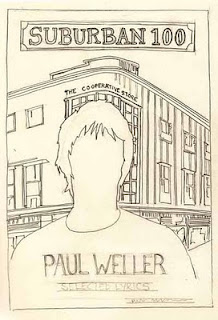
The other piece of work I chose was a book illustration by Peter Blake (see below) which was Suburban 100 by Paul Weller. Blake has been synonymous with music artists for several decades and his connection with Weller goes back years to his collaboration on the Stanley Rd cover.
The other piece of work I chose was a book illustration by Peter Blake (see below) which was Suburban 100 by Paul Weller. Blake has been synonymous with music artists for several decades and his connection with Weller goes back years to his collaboration on the Stanley Rd cover.
Figure 4 shows a fairly accurate copy of the original, which gives a fairly clear representation of the
cover artwork to be produced. Colour is an important factor in this design and notation could be made around the image showing colours to be selected. Its interesting to note that in an exercise which is looking at reducing the number of lines used, that Blake has not deemed it necessary to include any features on the face of this image and has relied on the 'silhouette' to be the dominant feature on this cover.
 |
| Fig 4 |
Most of the fine detail in the main building is removed in fig.5 but not necessary to convey the look of the design. The main lines still show the framing of the main figure and the direction of the perspective lines. The title line has been added along with rough text lines for the authors name etc.
 |
| Fig. 5 |
As a basic layout figure 6 only just works, but gives a very basic idea of whats the final illustration will be, I think it could work as an initial pitch and illustrates pretty well the 'bones' or frame of the visual despite the minimal use of lines.
 |
| Fig. 6. |


No comments:
Post a Comment