Total Pageviews

Saturday, 26 March 2011

Assignment 3 - A Poster.

Brief - to design an illustration for a poster for a music event - in this instance I have chosen a Jazz Evening. The poster will be A3 size. I started off with a spidergram, based around the word Jazz and all the associated words I could link to it.


I then put together a Jazz moodboard incorporating images, posters, designs that I had in mind to
use as inpiration for my poster.


I had in mind the idea of using an image of a jazz musician in a smoky club (dry ice of course), with a spotlight highlighting his profile to give a moody tone to the poster. Colours that appealed were 'cool' blues and purples, blacks and greys, with a splash of colour in the type.
From  there I moved on the working on some ideas in the shape of thumbnails and found myself going in the direction of abstract images of instruments.


Thumbnail 1

Thumbnail 1 gave me the idea of focusing on the shape of the double bass and the lovely scroll neck, then combining the scroll with a random keyboard. Not sure where to place the type on this and maybe it looks a bit busy.

Thumbnail 2
In thumbnail 2 i quite like the idea of the four big letters spelling out JAZZ in bright lettering, with an illustration of the trumpet running diagonally through the image. The other two thumbnails show the head and hands of a player emerging out of a dark background. This would probably work with the dark background being an ideal backdrop for the text to sit.
Thumbnail 3

The graphic image in Thumbnail 3 could work, a close up of the trumpet keys, together with the reflective chrome colours is nice, and the diagonal black bands in the background would make a good base for the text lines.

mock up from thumbnail 1

mock-up 2
 
Mock-up 2 does'nt work well with relation to the way the type reads. The background is too light in
places to allow a clear contrast. The image works quite well as it evokes the 'jazz' atmosphere
I was looking for. Still a way to go...


Enhanced by Zemanta

Sunday, 20 March 2011

Exercise - Making a mock-up

For this exercise I chose the book 'Two Wheels in the Dust' which is a sort of bicycle travelogue based in India. The premise of the story is that the author's journey is based on the Ramayana (Rama's journey), and the author was inspired by watching a beggar in India make his daily prayer to the Hindu god, Hamuman.
And so, the authors journey followed the mythological story of Rama, Sita and Hamuman from Kathmandu, in Nepal, to Kandy in Sri Lanka.


I started off by making a spidergram and documenting all the words and subjects, colours etc to come up with a fresh idea to illustrate the book. I liked the idea of showing the journey by a map and then also wanted to represent the spiritual aspect of the book so chose Hamuman - the monkey god as a good subject.


 I did some small thumbnail sketches based around different ideas, working on combining illustrations and photographic images alongside the titles.


I liked the idea of the cover looking like a piece of parchment, or sketchbook, so found a suitable texture to use in Photoshop and then decided on the map of India, with the route shown and then added the Hanuman image as I thought it balanced the page well.


I had to re-colour the parchment and darken it in order to increase the contrast between the drawings and the background. I think it looks like a well-worn travel diary, which was my initial intention.
The title was initially a problem in that it wasnt prominent enough and blended into the top of the map, but after some experimentation this was resolved by increasing the font and changing the word spacing. Initially the map was central to the page but this did'nt allow for the Hamuman to sit without his tail being cropped so moving it to the left side slightly solved both problems.

Friday, 18 March 2011

Project - Creating mock-ups

For this project the idea was to create a mock-up of a magazine page containing an illustration in
an editorial context. I have used the Paul Smith illlustration that I had done in an earlier exercise
and resized it to fit. For the text i used 'sample text' which is purely there as a visual representation
of how the type will appear. This would be presented to the client to give a fairly accurate idea of 
the finished article. 


Sunday, 13 March 2011

Note to self re. blogging...

Just needed to get this down in black and white. Despite early reticence and an inability to do computer stuff, I have grown and nurtured my blog into the strapping individual that stands before you, and I have to say, I love it. Its so much better (especially for illustration) to get all my work into one place, so that I can send it through to my tutor (and potentially the rest of the world), and receive back his advice and words of wisdom. And then, even more importantly, at the end of the the module, I won't have to package all my work into several humongous parcels, incurring vast postal costs and potential hernias for the postman, in order to get my work assessed. Yay, I say, it is a truly wondrous thing this blogging.. But there is a downside, and this is it. Due to time constraints bought about by such mediocre things as work, mortgage etc., I only have so many hours a week to dedicate to getting my coursework done, so I try and crack on with my work by firing up the lap-top at every opportunity, and opening up the blog. And thats when it starts. The shiny, sparkly diversions that catch my attention as soon I'm on-line. Favourite blogs and websites that I have selected for inspiration and encouragement inspire me to sit for hours window-shopping and encourage me to procrastinate at every opportunity. Granted, I am looking at (most of the time anyway) art-based stuff, and you could call some of it research, but its not helping me to get things done.
I think that now that its Lent, I will try and give up useless web-surfing and see if it makes a difference to my weekly output...
Watch this space.

Exercise - Client visuals - continued.

Album Cover - Keane - Under the Iron Sea.

The album cover above by Sanna Annukka for the Keane album - Under the Iron Sea is a favourite of mine. Influenced by her Finnish roots and folk art, this particular peice of work was produced in Photoshop where as she usually produces large format silk screens. Simple block colours and repeating shapes encompass the title of the album perfectly. In an comment taken from an interview on Keanemusic.com with Sanna, she explains her reasons for using horses in the piece;
"Horses are very symbolic creatures, they represent strength and power and also can symbolize coping under difficult circumstances, I feel that the horses are an appropriate symbol for the album as the theme of dealing with emotional battles and life’s struggles is very evident within the song writing. "
Single cover - Sanna Annukka
The cd cover for the single 'Is it any Wonder' above is again in the same style as the Horses illustration. It reminds me of traditional Maori art and is at one level simple and direct whilst at another, intricate and detailed. It seems the more you look at it, the more becomes apparent.

Cover art for Elbow by Oli East.
The album cover above for Elbow's new album, build a  rocket boys! is by Oli East and depicts a fairly abstract little figure running or jumping with his/her hands thrust into the air. The album is about adolesence so I would presume the figure is a youngster. Being a minimalist piece of work, the proof for this would probably look very like the finished piece.
Great album by the way!

Sunday, 6 March 2011

Exercise - Client visuals

Exercise - to edit an image to its main structural form and to practise creating a clear visual.


For the first image I chose an illustration for a book, 'A Long Way Down' by Nick Hornby with its silhouetted rows of buildings intersected with the title of the book and Authors name. Unfortunately, despite much searching I cannot find the name of the artist who illustrated it, so apologies to whoever you are. This style has been used to illustrate six of the authors other books as below.


Fig 1
Figure 1 shows the complete visual in which I have included almost all of the details. The windows, position of the Title and Name are positioned as they should appear on the finished job. I suppose an additional notation could be added as regards the colour pallette to be used.


Fig 2.

In Figure 2 I have simplified things slightly by removing the window details
and the hanging ropes between the titles. This still leaves a pretty good idea of how the final
illustration will look and leaves little to be required in imagination.
Fig. 3.

Figure 3 shows the visual in its most minimal sense. You can still get a feel for the front cover but because the title font is so large, and such an integral part of the illustration, it is unclear and not quite representative of the finished job.

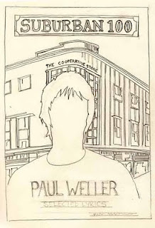
The other piece of work I chose was a book illustration by Peter Blake (see below) which was Suburban 100 by Paul Weller. Blake has been synonymous with music artists for several decades and his connection with Weller goes back years to his collaboration on the Stanley Rd cover.
Original Peter Blake illustration.


Enhanced by Zemanta
 Figure 4 shows a fairly accurate copy of the original, which gives a fairly clear representation of the
cover artwork to be produced. Colour is an important factor in this design and notation could be made around the image showing colours to be selected. Its interesting to note that in an exercise which is looking at reducing the number of lines used, that Blake has not deemed it necessary to include any features on the face of this image and has relied on the 'silhouette' to be the dominant feature on this cover.


Fig 4


 Most of the fine detail in the main building is removed in fig.5 but not necessary to convey the look of the design. The main lines still show the framing of the main figure and the direction of the perspective lines. The title line has been added along with rough text lines for the authors name etc.

Fig. 5
 As a basic layout figure 6 only just works, but gives a very basic idea of whats the final illustration will be, I think it could work as an initial pitch and illustrates pretty well the 'bones' or frame of the visual despite the minimal use of lines.


Fig. 6.