Total Pageviews

Wednesday, 1 February 2012

Tattoo me.


Last year I discovered the work of illustrator genius, Al Gray in the form of beautiful screen prints,
based in the style of Japanese woodcuts, but with a contemporary twist. As soon as I saw the first print
I knew this would be a great basis for a tatoo. 


The one above was the one that I wanted. I really loved the strong use of line and the composition of the figure, so I booked myself in for a full days worth and handed the illustration over to talented tattooist, Jamie Greaves of Real Art Tattoo. He explained that the tattoo would have to be changed slightly, especially the girls tattooed back, as the detail would be too fine to replicate, but thought it would look really nice in the form of a half-sleeve, with his Japanese style work, surrounding the figure. 
When the day finally came, I was really pleased with Jamie's design, which he then, by means of a transfer and hand drawing sketched out the tat. Six and a half hours later and stage 1 of my half sleeve was finished. I still have about another three hours left to go, with some colour to add and the remainder of the inside back of my arm (the painful bit), but I'm looking forward to it. Overrall, I'm more than delighted with my sleeve and as it heals the detail is really coming out. Its like my own moving work of art.


Enhanced by Zemanta

Wednesday, 16 November 2011

Assignment four - Magazine Illustration

The brief for this assignment was to develop an illustration for a magazine for the topic of 'Lost'.
The illustration is to be based on a still life of which I have the freedom to choose and have creative free rein. Decisions made on the choice of subject, arrangement and placing of subject in the frame, along with the choice of media should contribute to the overall description of the subject I have chosen.
To start things off I decided to do a spidergram based on word associations around the word Lost and tried to look at the less obvious linnks to the word.


Some of the words associations that came out of the spidergram were interesting, in that they made me think about the other meaning of lost, such as lost in thought, being emotionally lost, lost in thought and how I could convey these in the illustration. After some debate I decided to go the more obvious route and based my idea around Lost Property, by illustrating a sort of lost property collection, with each item in its own box referencing some of the word associations in the spidergram above, such as the heart for lost love or the road signs for loss of direction.


I was still not sure of the media I wanted to produce this work in and had an idea of producing a number of these 'lost' items as line drawings which I could then redraw in Illustrator. I have an idea of each item in its own coloured panel, drawn in white line and overlapping the other panels. The opacity of each panel is such that the colours will show through each.


These were the basic sketches I did with the intention of then producing digital line drawings in Illustrator. I was thinking of the obvious items such as lost teddy bear and shoe, but then the more random objects such as false teeth, (who wouldnt be without them) and then the skull which I thought would always look good on a shelf. I also included a sat-nav, which is vital whenever you get lost.


Above are examples of the illustrator line drawings, with the white out line on a strong background colour. Below are some roughs of the kind of page I was trying to create.

Rough 1

Rough 2
After some experimenting with this idea I decided to abandon and go back to a more traditional image, more in keeping with the rough line sketch I did earlier of the lost property cupboard containing the same objects, but a little less abstract. I also felt I had wandered away from the original brief which had stated the image should be in the form of a still-life.

From the visual above I produced a finished version in watercolour, pen and ink, as below.

Final artwork

It's been quite a journey to get to the above illustration but I'm pretty pleased with the outcome and feel it conveys the subject 'lost' quite well. Yes, it is a bit obvious at first sight but I think it offers something new every time you look at it. I then tried the image placed in the context of a page of editorial. See below.


Page mock-up

Page mock up
Looking at the final mock-up, seems to work quite well in the context of an editorial. 
In reflection I think I got sidetracked down the wrong route for a while and misunderstood 
the brief, which is the most important thing after all.  If you don't match the brief, then 
it doesnt matter how good the illustration is!


Enhanced by Zemanta

Saturday, 22 October 2011

Illustraphobia.


I dont think I'm the only person who's been worried or constrained by the sight of a blank sheet of paper and this seems to sum it up perfectly. (source - this isnt happiness.com)

Saturday, 24 September 2011

Exercise - Character development

The first task was to collect as many examples of possible characters and file them as types - ie. babies, children, sportsmen and old men so I collected these, scanned and downloaded them in to the relevant files, and to give an idea of whats in the file did these random moodboards for each;

Babies
Children
Sports

Old men.
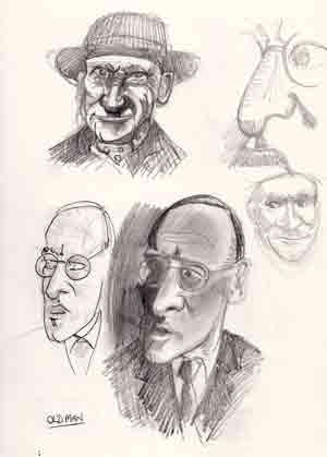
The next thing is to think about a character so I started with the idea of an old man and did a few sketches roughly based on the old Steptoe character as below.


To be honest got a bit distracted and decided to have a go at a different body shape below, which is based on a rugby player. Big, muscular gym-freak and did a front and side view of his frame trying to keep everything in proportion. Gave him a big lantern jaw and a heavy brow to finish the look. Quite like the look of him, looks like he could be useful in a ruck...


Also, did a couple of head views of someone who I seem to think looks quite a bit like Eric Cantona, which is  purely accidental but interesting nonetheless. Big eyes and nose to match, he seems like a nicer personality than Eric maybe?
Then moved on to 'Andy', the 'mans-man'. Ex-squaddy, aged mid 40's, likes going to the gym and playing rugby. Works in security on the 'doors' and is a bit of a lad. I've done a number of head shots of Andy, trying to show some different emotions, from confused to hungover. Think I've caught hungover quite well...


Then had a go at portraying 'Roger', the salesman from Staines who seems to be struggling with his career at the moment, and seems to have reached a crossroads in his life.

'Roger'


Friday, 26 August 2011

Sunday, 21 August 2011

Illustration Friday: 'Influence'.


Its that time of year again....glad I'm not in Xanthe..or Benidorm...or Ibiza...etc.etc.

Sunday, 7 August 2011

Exercise - Visual distortion.

Part 1. Draw a dog, I chose Archie, the highly-trained 5-month-old wonder dog mainly because of his unique posing skills. The task was to draw him in a way that made him 'real' and I tried to get over a sense of his personality.


As you can see from the pic, Archie is a Border Terrier with a kindly disposition. He's friendly with all animals and humans and his only vice (so far) is that he likes to 'christen' people he really likes with a sprinkling of 'wee'. I obviously chose to leave this particular trait of his out of the picture. Archie lives in hope of joining the police or armed forces as an attack dog, but as he is (a) not remotely aggressive and (b) doesnt know how to bark, its not looking good...


Next I had a go at trying to draw Archie in a limited number of lines and kept getting involved in 'detail' but did manage to do the image above in the middle of the page. 


I then did a line drawing and then tried to simplify my lines using the very minimum and came up with 
the sketches below which seemed to work better.

I think the two sketches above still manage to retain a feel for his personality and character.
Collage version.


Above are simplified line drawings using Illustrator and a bit of colour. Its interesting how simplifying the image can make such a difference to the finished article. The blue ones in particular using limited number of lines. Whilst drawing Archie I became more aware of his black rings around his eyes and nose which reminded me of a mask so I worked on the collage below.

'Fang'.
I used bread for his shoulders, hedgehog hair for some of his body parts and some ladies bikini bottoms  for his head. The icing on the cake and the source of his supposed super power comes from the fact that his ears have been made from Rachel Stevens abdomen...

The dog-pound always came out in force
if Fang was involved....

I have recently discovered the artist, Peter Clark, on t'internet who, it appears is a bit of a Jedi in the realms of collage, and to make it even more relevant, he does dogs (not literally). 


Peter uses a comprehensive collection of found papers as his palette which are coloured, patterned or textured by their printed, written or worn surfaces, with this media he 'paints' his collages. He shades with density of print and creates substance and movement with lines plucked from old maps or manuscripts. His pieces use mark-making in an innovative and humorous way to create a collection of beasts and clothing which exude character and wit.


Check out www.peterclarkcollage.com to see his other brilliant work.