Total Pageviews

Saturday, 11 December 2010

Visual Metaphor - reaching Retirement

The object of this exercise was to take the phrase 'Reaching Retirement and create a drawn list of objects which could be used to symbolise them. Drawn as rough sketches they are more about the ideas created than the quality of drawing. Visual shorthand...
First though I wrote out a spidergram, generating words and phrases which led to other ideas and avenues of thought.


Its interesting the way your thoughts on retirement and old age swing from the positive side of things, such as more holidays, more free time and leisure, to the negative and pessimistic side which involves 'the unknown', money, ill health and the side effects of aging.

I came across these interesting and inspiring quotes which threw a more positive slant onto the subject of growing old gracefully, or maybe thats just the point, that you shouldnt have to step back into the shadows, but should carry on regardless and enjoy life to the max. This reminds me of my favourite line, which I intend to stick to;  
 "You can't be young forever, but you can always be immature."

 Hence the little logo of the old guy on a skateboard, plus the more obvious angle of time being on your side, or running out, the sands of time, and the autumn leaves which I thought was a nice metaphor for the 'autumn years'.


On the Autumn Years theme, I developed this idea of a ring of autumn leaves, which I thought would be a good idea as a frame around another image or maybe some copy.
I think this has a lot of scope for improvement and could be used in a number of ways, plus its not too obvious or cliched.


Some of the scribbles on this page follow the more typical route, such as palm trees on sandy beaches, exotic locations, putting your feet up and piggy banks.

The 'everyday is a weekend calendar' is a positive slant though and developed from the quote, 'every day is a Saturday'.


Quite like the idea of showing the progression of aging, and this got me to thinking about 'the evolution of man' image, with the baby replacing the caveman, and then growing up into the adult, and then regressing back onto all fours and then, eventually the mobility scooter... bit depressing really....

On the same theme, I like the idea of a sort of line-up, starting with the baby and showing the changes through adolescence to adulthood and old age. I can see on reflection that I am going off on a bit of a tangent here, and maybe reflecting too much on 'aging' instead of 'retirement'.


I have kept the line drawing of the Autumn Leaves Ring and will develop this further, maybe in Illustrator.


Mod Mobility Scooter.
On reflection, and after talking to others about the images, I think I have managed to find some relevant symbols and connections to retirement, apart from the obvious well-trodden route of 'nest-eggs' and piggy-banks. I think that with reference to my earlier comments about the negative side of the aging process, I have tried to inject a touch of humour and positivity to the subject.

Friday, 12 November 2010

Exercise - Visual Metaphor

Exercise - collect samples of visual metaphor.


Daniel Bejar
 Religion and war is always a bountiful subject to pick from when looking
 for a powerful metaphor, such as the way violence has been used in the name of religion.


Banksy


 Banksy makes a powerful point in the most simplistic way by making the dove a target as well as a symbol of hope and peace, thereby emphasising the fragile nature of peace.


by Mou5e

Clever use of design and type make this image work and illustrate
the potential and power of words.


Asaf Hanuka

This illustration takes the subject of a childs doll and turns it usual associations on its head. In this instance the doll represents a hazard or danger to the child as opposed to the usual representation.


Band Aid


'Heal the World' - Band Aid have used the peace symbol created from plasters for this fund-raising image in aid of the Mumbai Taj Mahal hotel victims.


Christopher Ryan


Daniel Bejar
Javier Jaen Benivides

Enhanced by Zemanta

Sunday, 31 October 2010

Choosing Content - final.

Create a simple portrait of the character, using the reference that you have gathered.


Sketchbook images.

Hand drawn in pen then photoshop.


I'm sticking with the film-noir type picture of a head and shoulders image partly submerged in the shadows, with the face partly highlighted by a shaft of light. Ive tried to include the sight of bomb-hit London and St Pauls in the window.


Same pic but I tried adding a bit of dramatic colour to the image, which I think works well.


My final pic in this exercise is another version of the themes I have worked above, I like the drama of using black and white with a hint of sepia brown. I think the reference I have gathered has led my
thoughts and ideas along the route of the 'film-noir' look with such films as The 39 Steps and The Third Man used as inspiration.


Sunday, 24 October 2010

Exercise - Choosing content continued...


Mood-board for colour and texture
Next step - create a simple portrait of the character, using the reference gathered;


pen & ink sketch

 
pen & ink


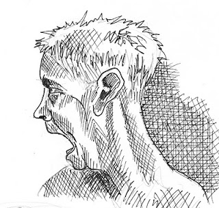
These initial sketches were based around the word 'infuriated' but on reflection seem a little extreme
for and too far from the storyline, so went back to the brief and my initial ideas on what the character would look like, at least in my mind. 


Watercolour sketch
  

This is along the lines of what I envisaged when reading the passage. Its starting to encompass a lot of the words I originally brainstormed like frustration, anger, and I think there is an underlying representation of this in the sketch.
I will work on this theme and image some more, along with the background setting. Bit confused as to how this is to be achieved, but will work it out.


watercolour sketch


 This guy looks a little too serious for me but maybe thats a good thing....not happy with it, but thought I would post it anyway to show my thought process, or lack of it.
Enhanced by Zemanta

Thursday, 14 October 2010

Exercise - Choosing content.

Task - to read the following text and then answer questions to follow;

The room was void and unquickened; it was like a room in a shop window but larger and emptier; and the middle-aged man who sat at the desk had never thought to impress upon what he entered every day. Comfort there was none nor discomfort; only did the occupant deign to qualify the pure neutrality of his surroundings, it would surely be austerity that would emerge. The spring sunshine turned bleak and functional as it passed the plate glass of the tall-uncurtained windows.

The windows were large; the big desk lay islanded in a creeping parallelogram of light, across this and before the eyes of the man sitting motionless passed slantwise and slowly a massive shaft of shadow.

Perhaps twenty times it passed to and fro, as if outside some great joy wheel oscillating idly in a derelict amusement park. And the man rose, clasped hands behind him and walked to a window - high up in New Scotland Yard. He looked out and war-time London lay beneath... on his brow was a fixed contraction, this he had carried from desk to window, and now there was neither hardening not relaxation as he looked out... during 15 years he had controlled the file of police papers which dealt with the abduction and subsequent history of feeble minded girls. Here lay his anger as he looked out over London... year by year the anger had burst deeper until it was now the innermost principle of the man.

If this were to be made into a film what would the main character be like?
What clothes would the character be wearing?
What furniture is in the main area in which the action takes place?

I see the main character as a middle aged man, as the text says, tall, athletic, dark hair, greying at the temples. His features are strong,  distinctive, and he has a clipped moustache. I've just realised that I have described Clark Gable...not sure about the moustache now.
He would be wearing a grey wool suit trousers and waistcoat. His jacket would be off, his sleeves of his white shirt rolled up, and a burgandy tie  hangs loosely around his undone collar. His black overcoat and trilby hat are hanging on the hat-stand.
In the centre of the room is a large mahogany desk on which  is a black telephone, in and out trays, typewriter and a leather-framed blotting pad. A brass desklamp sits on the desk and in the background is the hatstand and some metal filing cabinets.


Image search moodboard.
In the moodboard above are images that reflect my interpretation of the story. Dark spartan offices, Dick Tracy type detectives with the hat and mac, bombed out London, 40s furniture pieces, adverts and comic books and samples of tweed patterns along with some of the colours I would like to incorporate into my pic.

Choose a word, which captures the mood you would like to convey and collect  and create colours and textures to form a moodboard to give a general impression of the word.

Word brainstorm - moody, determined, frustrated, murky, dark, shady, arcane, enigmatic, bleak, cheerless, sullen, morose, ominous, dreary, unpromising, disappointed, discouraged, disheartened, embittered, angry, thwarted, simmering, INFURIATED...

Came across this interesting chapter below with reference to using colours to convey emotions etc.

Colour and Emotion in Art – Edvard Munch and Vincent van Gogh


The expression of emotions, and emotional responses, can be a central concern of artists and designers. Their aim may be to express their own emotions, to induce a particular emotional response in others, or both. Another possibility is that emotion itself might be the subject matter of a painting. Edvard Munch and Vincent van Gogh are well known for the emotional intensity of their work.

Munch described the experience which inspired his most famous painting The Scream: ‘I was walking along a road one evening… The sun went down – the clouds were stained red, as if with blood. I felt as though the whole of nature was screaming… I painted that picture, painting the clouds like real blood. The colours screamed.’. In a later painting he drew heavily on the compositional elements in The Scream to express Anxiety. An observation about Munch by his friend, the poet Sigbjorn Obstfelder, is quoted by John Gage; ‘He feels colours and he reveals his feelings through colours; he does not see them in isolation. He does not just see yellow, red and blue and violet; he sees sorrow and screaming and melancholy and decay.’

Van Gogh wrote passionately about his ideas. He regarded colour as one of the keys: ‘instead of trying to reproduce exactly what I have before my eyes, I use colour more arbitrarily, in order to express myself forcibly.’ (p.6). In letters to his brother he describes his intentions for his painting The Night Café: ‘I have tried to express the terrible passions of humanity by means of red and green’ (p.28). And then: ‘In my picture of the Night Café, I have tried to express the idea that the café is a place where one can ruin oneself, go mad or commit a crime.’ (p.31). In a letter to fellow painter émile Bernard, written from the asylum in St Rémy, van Gogh links a particular colour combination specifically to a particular emotional state: ‘this combination of red ochre, of green gloomed over by gray, the black streaks surrounding the contours, produces something of the sensation of anguish, called ‘noir-rouge’ (black-red), from which certain of my companions in misfortune frequently suffer.’

Osvaldo da Pos and Paul Green-Armytage*
Dipartimento di Psicologia Generale, Università di Padova, Via Venezia, 10-35131 Padova, Italy
*Department of Design, Curtin University of Technology, GPO Box U1987, Perth, WA 6845, Australia

continued...

Saturday, 9 October 2010

Using Black & White continued....

Fig. 1
Fig. 2


Finally managed to sort out the white on black images and here they are...
Amazing what a difference they make from the white pics and I''m starting to see the shapes and potential
for the next stage of the exercise.
Next step is to do the cut-outs - think I will work on Fig.1 as the shapes look stronger.
tbc.
Enhanced by Zemanta


Here is the finished version of  'Building', after several hours of cutting and pasting, I'm quite pleased with the 'graphic' feel of it. I know that you would'nt really have such strong shadows in the image but I like the contrast between the dark black solids and the web like structure.


 Also thought I would try the inverted version as I really like the idea of whiting out the blocks and the
finished look. It needs working on in Photoshop, but as a whole I think it really works as the white blocks give the feeling of light bursting out of the building. For some reason the image seems to have changed size during the journey onto the blog?


Its interesting the way the added white shapes give a solidity to the building and a certain depth to the building.

Below are some images by different artists that I would describe as graphic, and have used just
black and white to great effect.


Riverside grafitti by Banksy - imaginative and powerful..

A couple of posters by an artist called Rigo, both 'building' based!
 
Another by Banksy - always original.


Thursday, 7 October 2010

Exercise - Using black and White

Object of the exercise was to create a line illustration around the word 'Building' so I began by playing around with the word and others associated with it such as the obvious ones like construction, brickwork, housing, architecture etc, and then on to other meanings and associations such as lego, meccano, society, slums, ghetto, housing, grids, spiders web, career, prospects. I then googled as many images on the words above to give ideas on suitable images.

One of the avenue's of thought I went down was the idea of a spider building a web and using the patterns within the web to spell out the word, but lost interest or enthusiasm for this path and then decided to go back to the more obvious route, probably because I liked the shapes and options that a more typical construction image offered.

I then worked on a couple of images of construction sites that seem to offer a strong feeling of composition. I liked the one below mainly because of the shapes within the building which had a 'web-like' quality. (spider-talk again) but I could see that it had great potential when reversed to white on black.


Both contained several cranes which, because of the way they are built,  and drawn would hopefully lend themselves to a strong graphic image. The next image also had some really strong shapes that would look good in the negative.

I then scanned the images, and using Illustrator, Photoshop and fairy dust managed to invert them, creating a white on black reverse pic which gave a really interesting and different view on the image drawn.

t.b.c. as soon as I work out how to compress the other files....

Saturday, 2 October 2010

Local Art Exhibition


Buddha II


I decided to enter four of my paintings into the local village art exhibition at the last minute this week as I'd just had a couple framed and the invite had just arrived the week before. I'd always visited the exhibition in the past, and had good intentions to enter something, but somehow always seemed to never find the time or some other excuse, so this time I grabbed the bull by the horns and just did it.


Old Friends
 

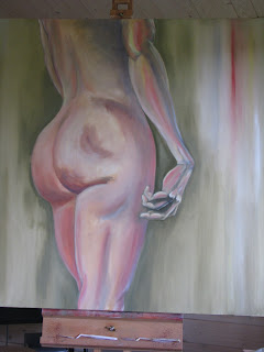
I felt a bit self-conscious as I walked into the hall on the Friday night carrying a huge oil painting of a mans arse, and wondered if I'd chosen the right sort of subject for a village exhibition, but they seemed a nice crowd and looked like they didnt mind my two buddha's, a pair of boots and David's backside. (Michaelangelo's David by the way)..


Buddha I


 When I returned the next morning to the exhibition I was pleased to see my paintings hung in a really nice position right near the entrance. There were over a hundred exhibits from 43 artists covering such mediums as watercolour, oil, batik, pottery and photography, with a wide and eclectic choice of subjects. Anyway, I enjoyed showing my work and had some positive comments, so maybe I won't wait so long to enter the next one.


Back of David

Enhanced by Zemanta

OCA BLOGGER OF THE WEEK!

Great news! I received an emaiil from Gareth at OCA informing me that this blog had been chosen as
Blog of the Week and after only one day I've doubled my followers to a mighty six and passed the thousand hit mark, just shows the power of OCA...
Blow that trumpet.....

Blog of the Week: Rob’s Learning Blog


September 29, 2010

By Gareth

Blog of the week this month is Rob’s Learning Blog. It is one of the first illustration learning logs I have seen – the course was only introduced this year, but has has exceeded expectations in terms of enrolments. I was struck not just by the quality of the drawing but also by the effort is putting into the research for his course. Enjoy.


3 Responses to “ Blog of the Week: Rob’s Learning Blog ”

Eileen on October 1, 2010 at 7:21 pm

It’s a great blog – well worth checking out.

mp governale on October 1, 2010 at 9:00 pm

‘has exceeded expectations in terms of enrolments’, I was hesitating between 2 courses. Marion from About.com Painting suggested that I looked at Rob’s learning blog – and that made my decision easier. I’ve been on the Illustration course with OCA since September. Thanks Rob or is it Bert?.

Rachel on October 2, 2010 at 8:58 am

What an inspiring blog, as a fellow blogger I am now following Robs Learning Blog and look forward to seeing more of his work, well done!!! Rachel x


Sunday, 19 September 2010

Exercise - a subjective drawing.

Follow the Yellow Brick Brogue....
After many trials and tribulations with Illustrator and Photoshop I finally managed to come up with what I wanted... things have moved on from the idea of the 'brick brogue' to the image above.
Its been a difficult exercise to pin down and below are some of the ideas I had along the way...

First draft on my Tree of Soles idea, drawn on a kraft paper in pen, which I then scanned and digitally coloured, see below.
Below is my original idea of a hand drawn image which I wanted to
digitally render, and then got sidetracked into the image below - the denim brogue!


Saturday, 4 September 2010

Exercise - subjective part 2

Things have changed in my thinking on Subjective brogues, or evolved as I have moved onto the idea of the brogue as a 'well-built' item. Words from the list such as strong, robust, constant, all lead me to the idea of making the shoe out of bricks or metal which led me to the sketches right of brickwork brogues! I guess this is how its supposed to work, with a brainstorm based on words and ideas which feed other ideas until you come up with something  thats workable. Anyway, I'm going to work some more on the brick-brogue as I still think it looks stylish, even in bricks...