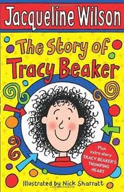
For this exercise I had to gather as many examples of images for children as possible.
The following images go with the following age groups;
Pre-reader.
Usually these are mostly just picture books and are often made from cardboard as the little ones take as much pleasure in eating the book, as they do looking at it. Plastic, material as well as heavy-duty paper are also popular, and often come with squeakers, sound-effects and pop-ups. Spot was always popular.
Pre-school (3-5)
From what I can remember, my kids always loved Spot the Dog, drawn by Eric Hill, which was always furnished with a few memorable words on each page to describe the scene being shown. It always amazed me how quick they memorised each page. Julia Donaldson books, drawn by Nick Sharratt are a popular read, offering repetition, numbers and lively images.
Early reader (5-7)
Repetition, rhyme and the use of poetry is important in this age group and the images can be more detailed.
Established reader (7-9)
The books this age group are interested in can be more sophisticated, less obvious in their storyline allowing the children to develop their inference skills. Images can be more detailed, slightly scarier even.
Older age groups
Longer storylines, often less images throughout with the emphasis being on the strength of the storyline. More use of comedy and a brighter, trendier cover.
The following images go with the following age groups;
 |
| Pre-reader. |
Pre-reader.
Usually these are mostly just picture books and are often made from cardboard as the little ones take as much pleasure in eating the book, as they do looking at it. Plastic, material as well as heavy-duty paper are also popular, and often come with squeakers, sound-effects and pop-ups. Spot was always popular.
 |
| Pre-School. |
Pre-school (3-5)
From what I can remember, my kids always loved Spot the Dog, drawn by Eric Hill, which was always furnished with a few memorable words on each page to describe the scene being shown. It always amazed me how quick they memorised each page. Julia Donaldson books, drawn by Nick Sharratt are a popular read, offering repetition, numbers and lively images.
 |
| Early Reader 5-7 |
Early reader (5-7)
Repetition, rhyme and the use of poetry is important in this age group and the images can be more detailed.
 |
| Established reader 7-9 |
Established reader (7-9)
The books this age group are interested in can be more sophisticated, less obvious in their storyline allowing the children to develop their inference skills. Images can be more detailed, slightly scarier even.
Older age groups
Longer storylines, often less images throughout with the emphasis being on the strength of the storyline. More use of comedy and a brighter, trendier cover.
I really like this set of stamps featuring childrens illustrations and the diverse styles of
each one. Some very sophicated and others very simple and childlike, but each
working in its own way.
 |
| Spider-grams finding appropriate word connections for the words 'discovery' and 'journey'. |
Below are some of the images I have sketched of various animals, with the
intention of aiming towards the 3-5 year old pre-school reader and also the early readers 5-7.
I think the travelling rabbit shows promise, looks a bit serious for
the little ones though....could be ok for the older children though.
For some reason, I really like the idea of drawing cows and I think
they always look a bit 'thick', also not sure if they work very well
doing activities other than eating grass or farting..
I've moved on to the idea of a travelling octopus......
below are some ideas of what he might look like.
'Olly's journey could be based on images of his adventures, from
starting out, planning his trip to catching the train, and then
followed by images of him visiting famous world sites.
This could work well for small children in a geographically
educational format.
Olly's look is starting to come now, I like the idea of putting him in different
situations, doing stuff that Octopus's dont normally do. He also has the
benefit of eight arms/tentacles, so there's plenty of scope for artistic licence.
I have decided to go for a really simplistic style, so as not to confuse the younger children, although,
thinking about it, I dont really believe that images have to be ultra-simple for
a young reader to appreciate them. Kids love looking at things, regardless of how complicated
they are, and tend to be selective and take away their own key points and views.
However, if an adult sits with a youngster and helps him/her to go through the book,
the child can be steered in the right direction,.....i think.
 |
| Rough colour of cover |
I like the idea of a the pages in the book looking like a polaroid photograph
of each travel page with 'Olly' in the foreground of a famous landmark.
I've tried to keep the typeface 'fun' and informal. also I have the idea of
allowing the octopus to change colour ( I seem to remember them being able to do this),
like a chameleon and this could go down the road of 'Where's Olly'? as most
kids love a bit of hide and seek.


No comments:
Post a Comment