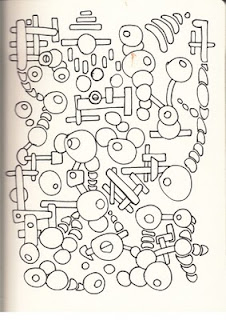
Task - Listen to a piece of music by Miles Davis and as you listen to the music, create marks to illustrate your interpretation of the essence or mood of the piece.
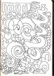
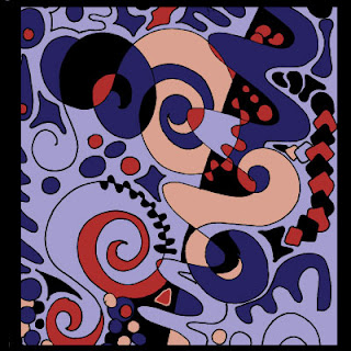
I chose the Miles Davis track 'All Blues' from his album, 'A Kind of Blue' and just listened to the music, whilst making marks, patterns and squiggles that I felt represented the mood and feel of the track. I intended to start with a pen drawing, and then add colour and alterations in Illustrator.
 |
Penterpretation 1
|
Its difficult as you sit there with your pen, trying to 'draw' the music or mood, but I suppose I'm comforted by the fact that there is no wrong or right answer. Its just my interpretation. After looking at my first efforts several adjectives came to mind such as swirling, spiralling, rounded, spiky, smooth, but I think the one that suits the piece best is 'spiralling' in the way the music seems to peak and subside.
 |
| Penterpretation 1 coloured in Illustrator |
It seems obvious to choose blue as the predominant colour for this image, but it suits the piece and reflects the cool, smooth feel in its neutrality, with the darker red offering contrast and the blacks emphasising the peaks and shadows, and giving a sense of depth.
 |
| Penterpretation 2 |
This is my second, and very different sketch which I intend to visually adjust in Illustrator. I dont think the drawing really does such a good job as the first effort but there are elements which work.
 |
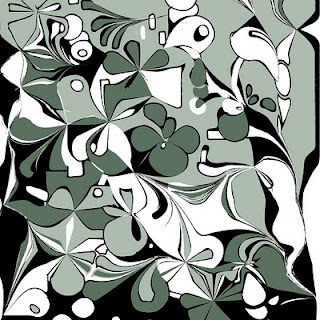
Illustratored Penterpretation 2
|
As you can see, the digitally adjusted image above bears little resemlance to the scanned image 2, but once I started to distort the marks I had made, whilst at the same time listening to the track, it seemed to evolve and the actual process of 'warping' and distorting the existing marks seems to suit the task. I kept the colours cool and reserved and feel this one captures the mood.
I decided to go the dgital route, by drawing in Illustrator and then manipulating the basic image and I feel these are more successful. I think I have improved on the one above by toning down the colours in the one below to give a cooler more mellow feel.
I have also introduced some graduated tints into this one, along wth more subtle use of black.
Simply by increasing the stroke of the black line has given the image above more definition and changed the
mood of the pic quite dramatically. It feels stronger.
Another different approach which I feel offers a representation of the track, just trying to
show another avenue.
Spiralling seems to suit this image pretty well but I am pretty happy with all the Illustrator images. They are all quite different but each version has its merits. I think they could all be used for a cd cover, but then i would, wouldn't I?


